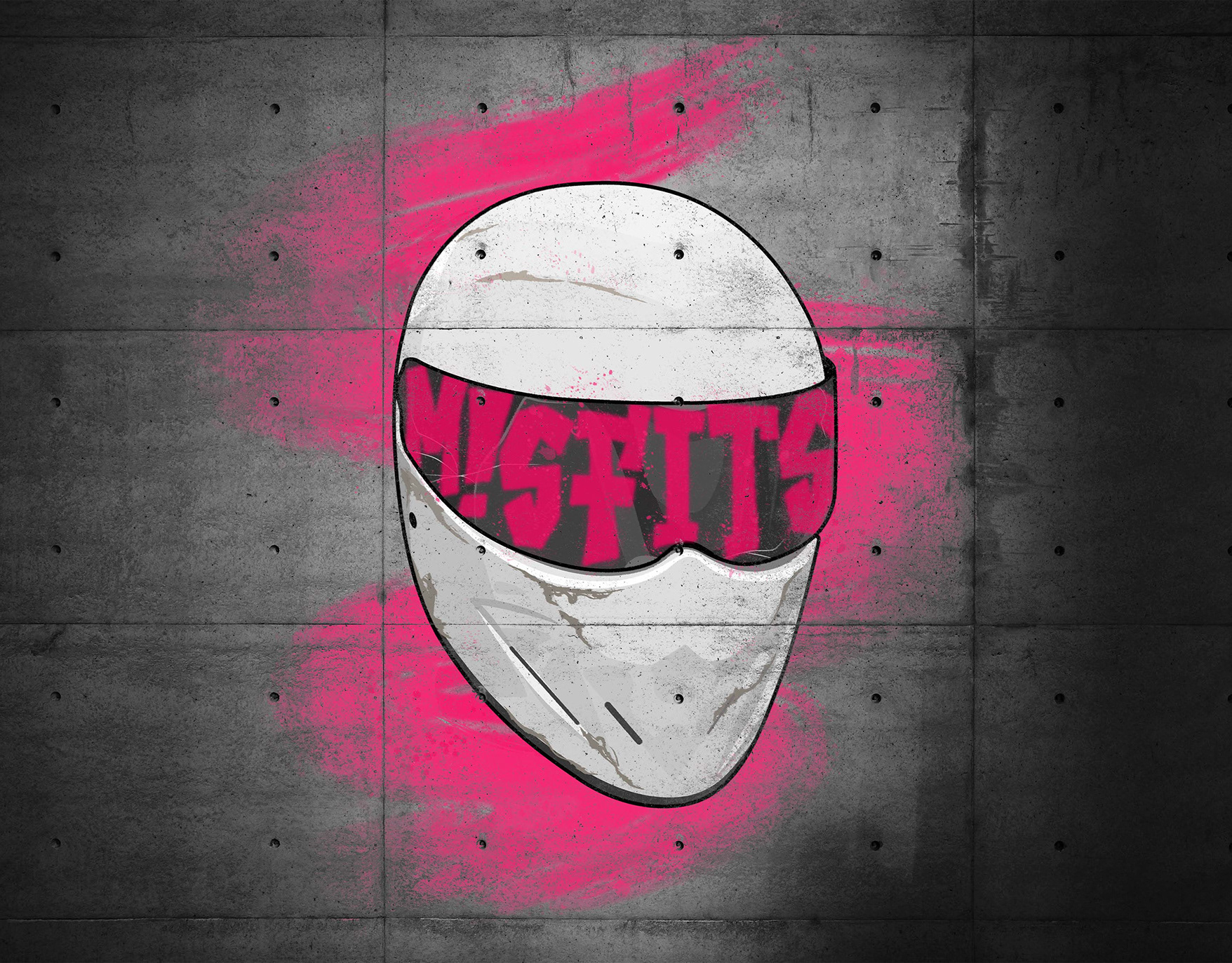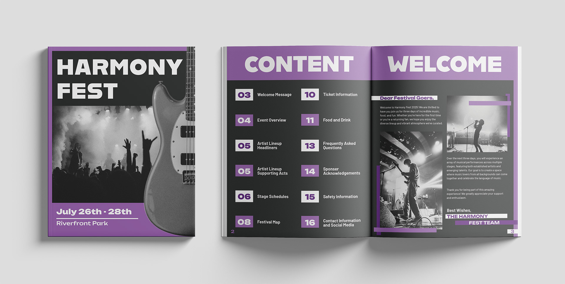
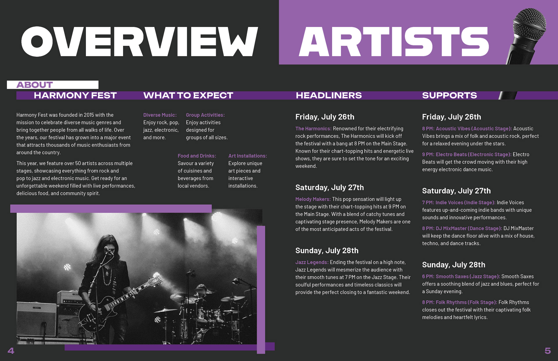
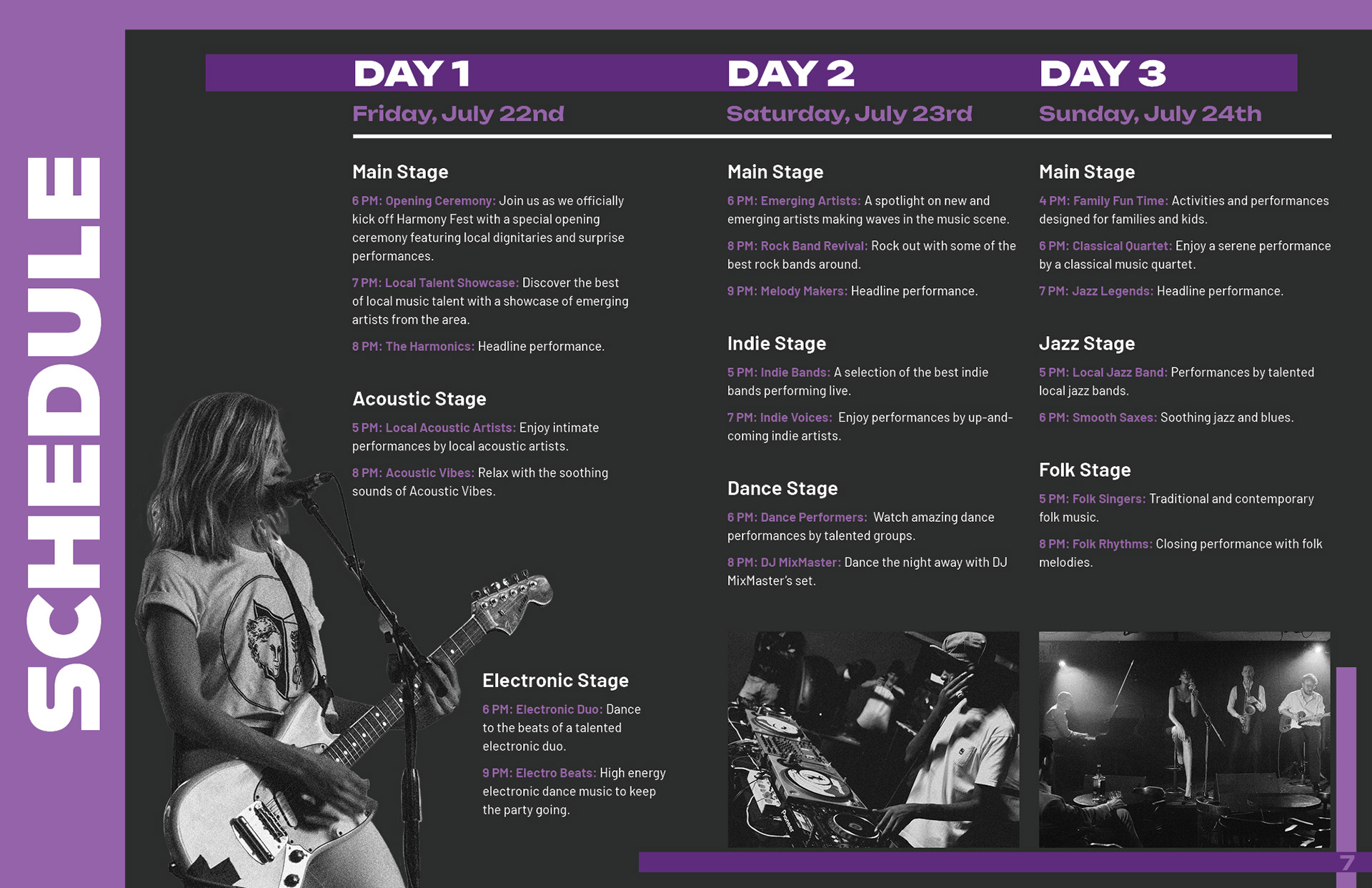
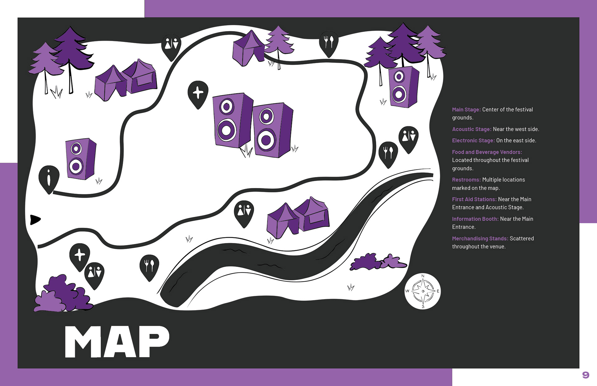
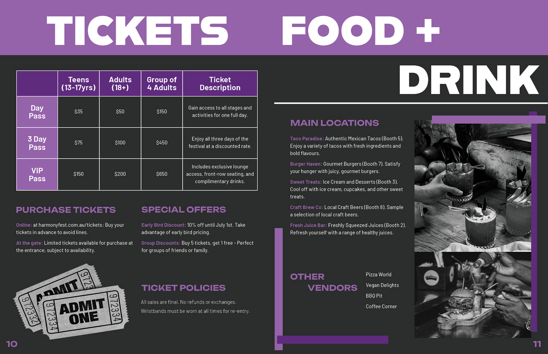
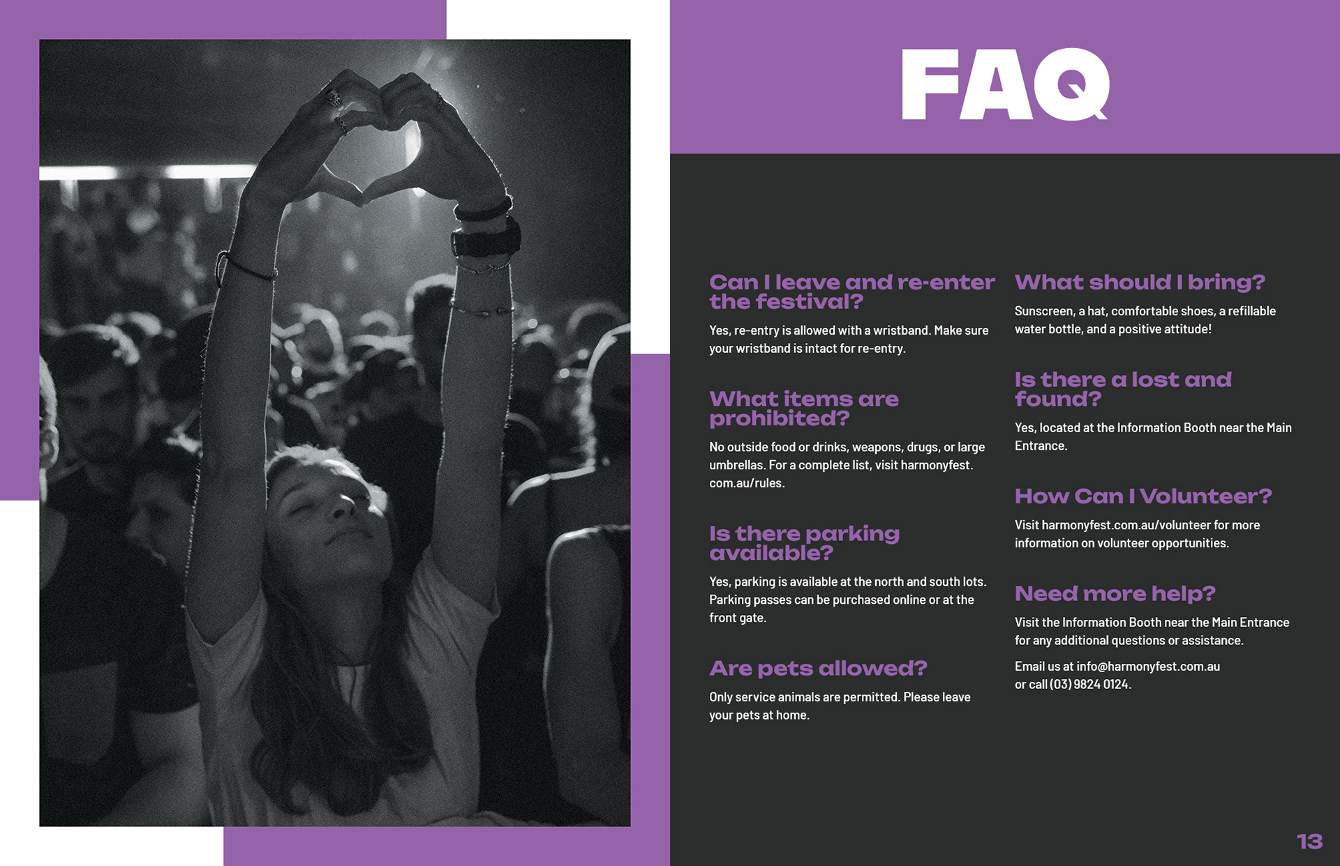
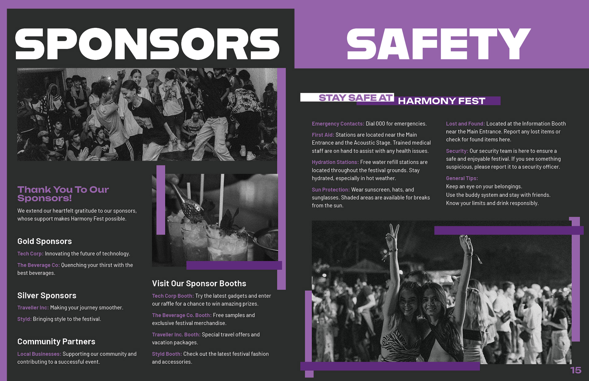
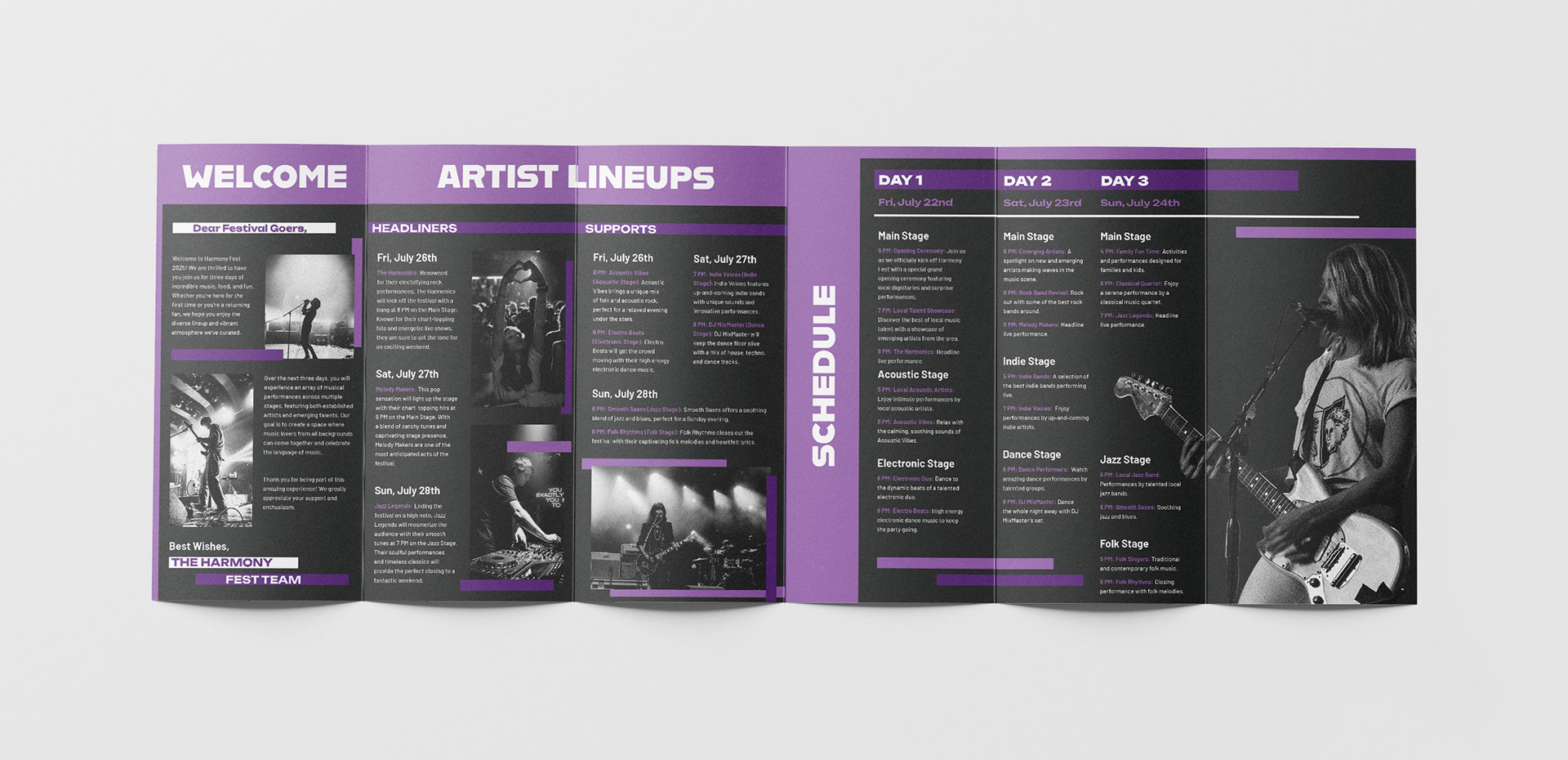
Harmony Fest is a conceptual music festival promoted through two complex layouts: a 16-page booklet and a 12-panel brochure. The brief was to create both layouts with essential festival information and a map, while maintaining a cohesive style. The type of festival and overall theme were up to my interpretation. I chose an edgy, retro theme, using bold typography, bright purple hues, neutral shades, and grainy black-and-white images. The grain adds a rock-inspired, textured feel. I aimed for layouts that are bright, fun, and attention-grabbing, using purple lines layered around and on top of images to guide the viewer’s eyes across each spread. This rock-inspired, maximalist aesthetic was deliberately designed to capture attention and engage viewers, creating a memorable impression that encourages them to attend the festival.